
Katie Constans
(she/her)Advertising, Art Direction, Branding, Web Design, Visual Design
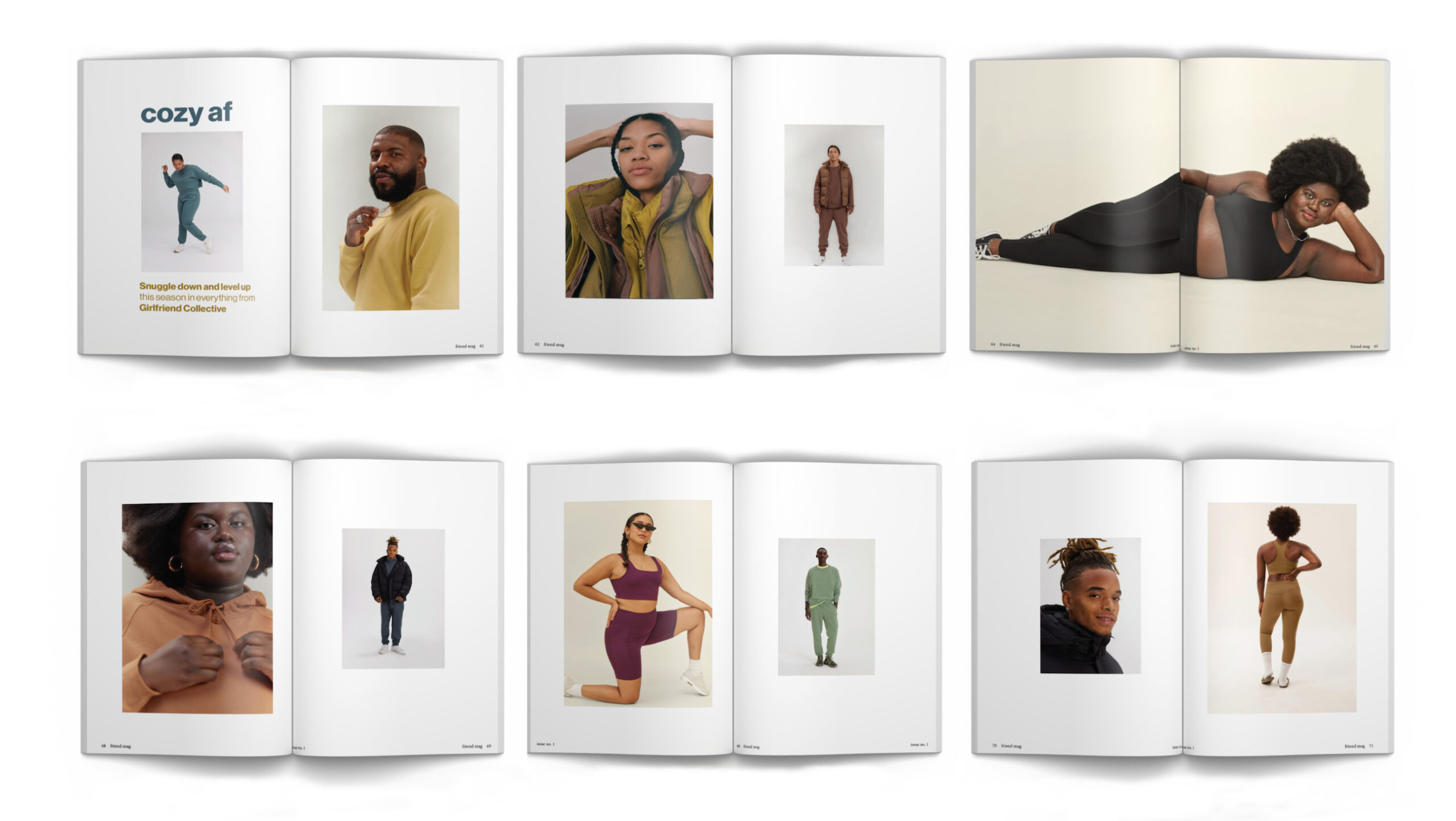
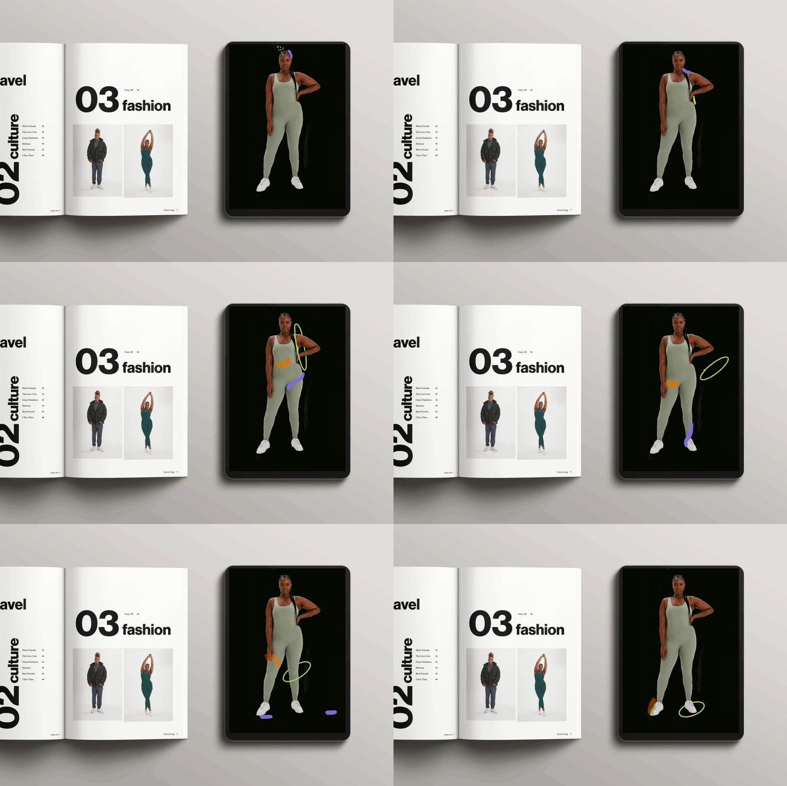
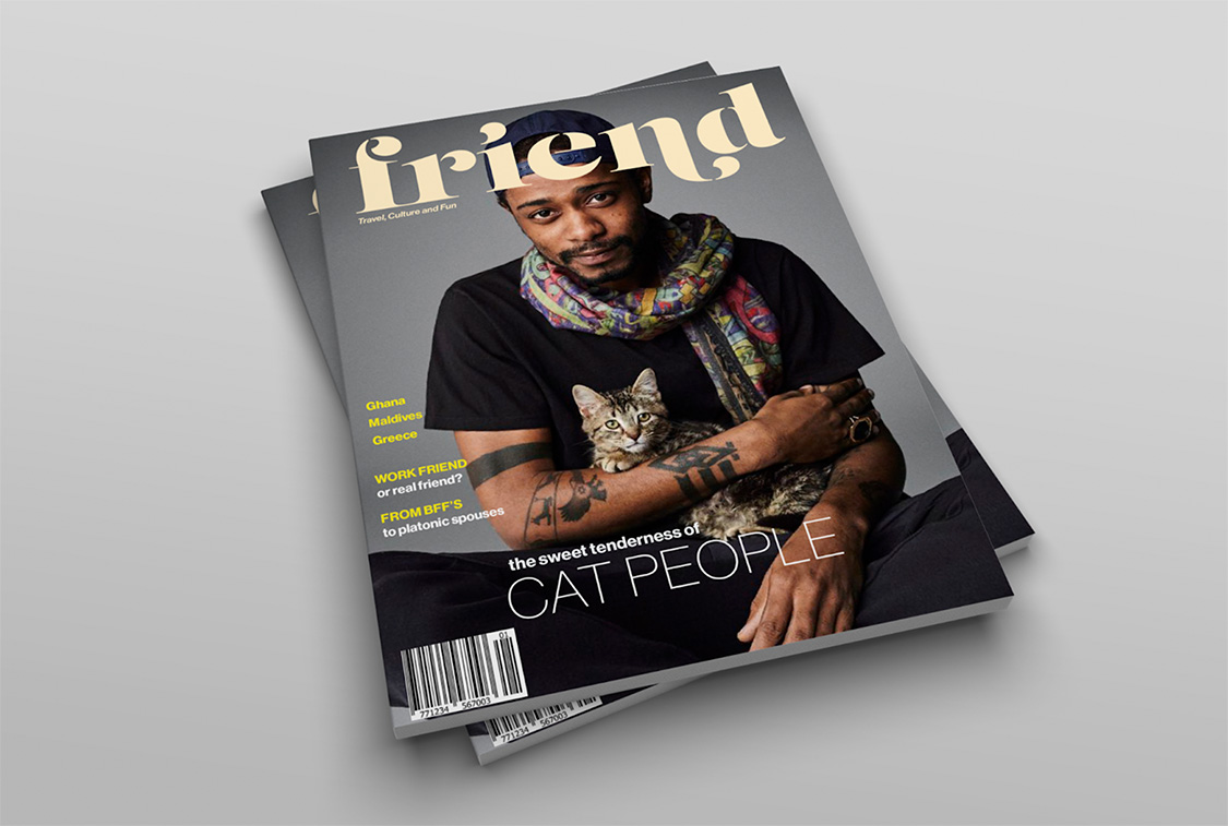
Friend Magazine
- Art Direction
- Branding
- Layout
- Print Design
- Visual Design
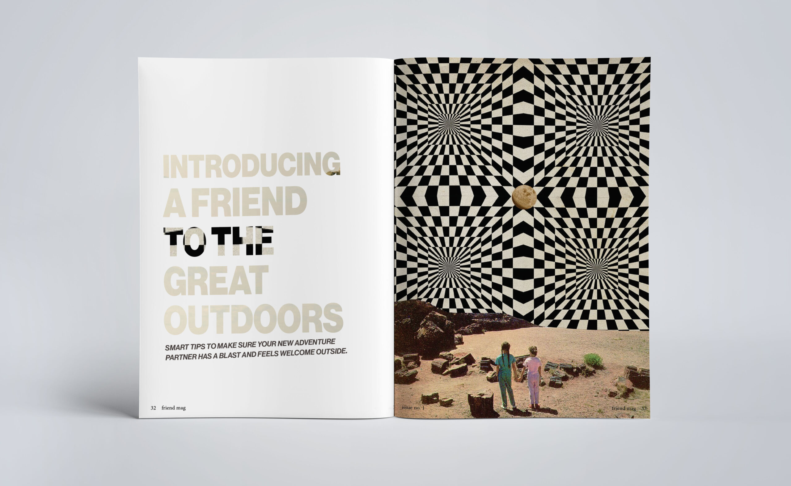
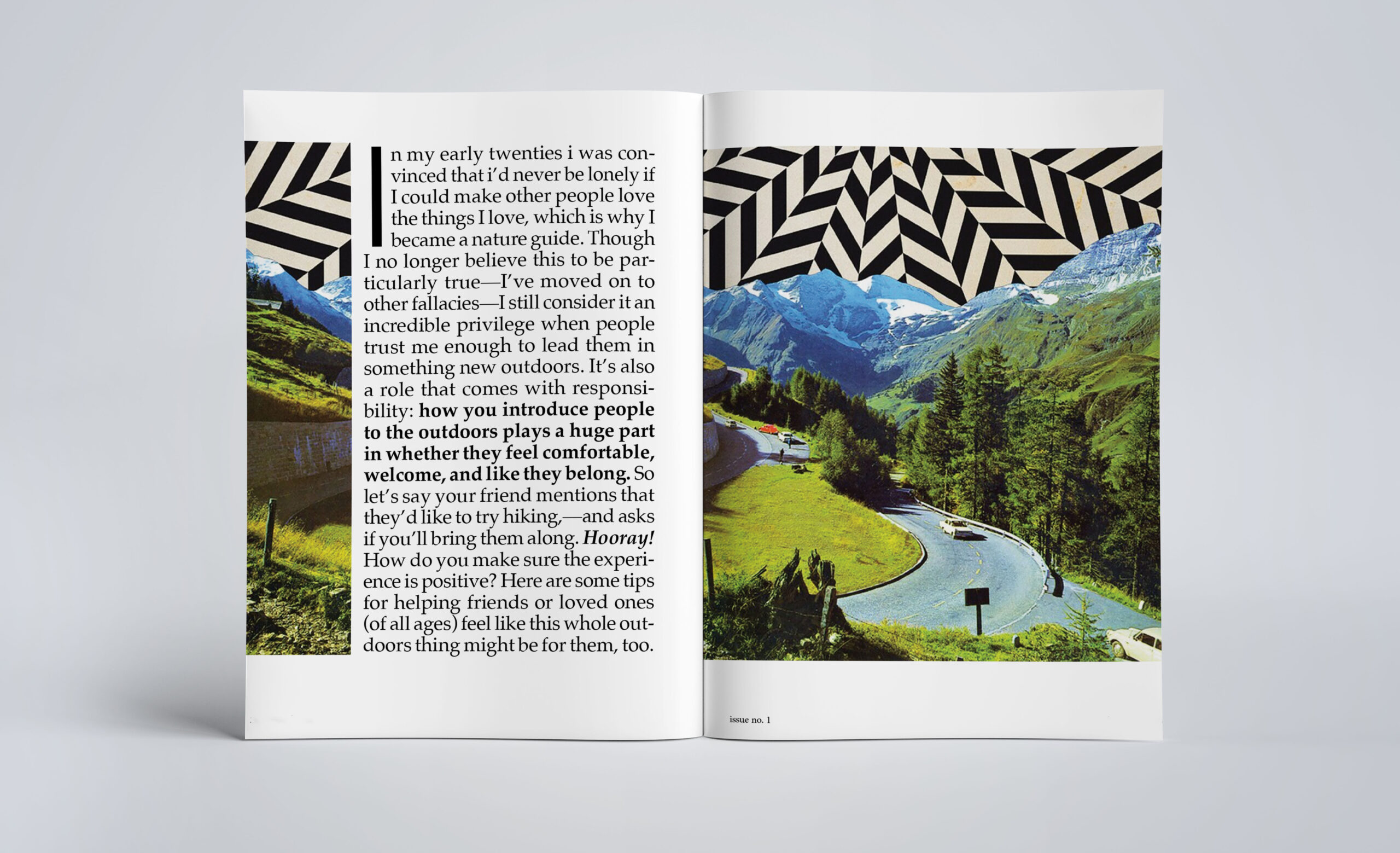
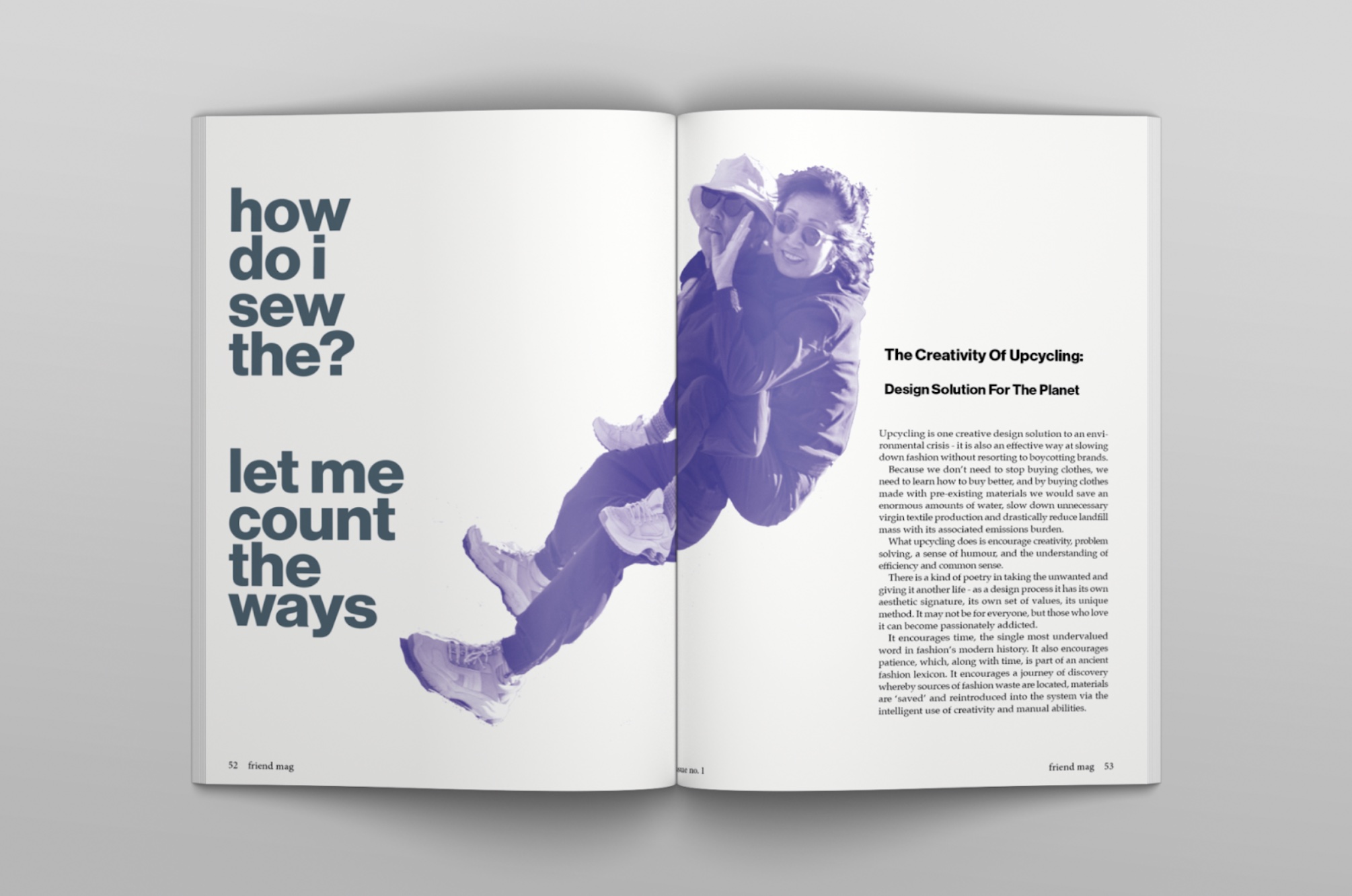
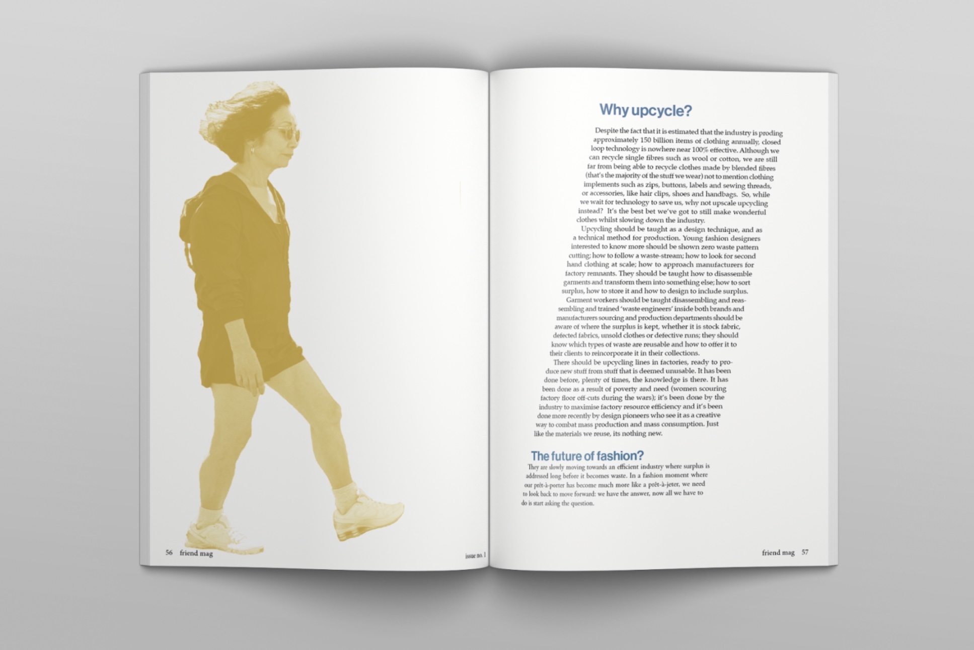
A magazine dedicated to diversity and friendship. Both of these make us better, stronger and more successful as humans. The vibe is like your fun, city wise friend who loves to travel, introduces you to new ideas and exposes you to different cultures.
Red Light Vintage Rebrand
- Advertising
- Art Direction
- Branding
- Layout
- Visual Design
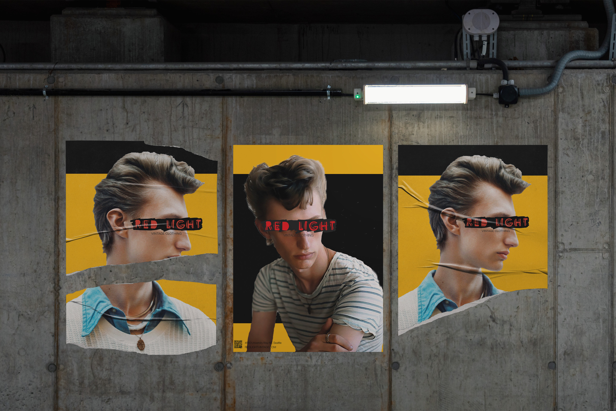
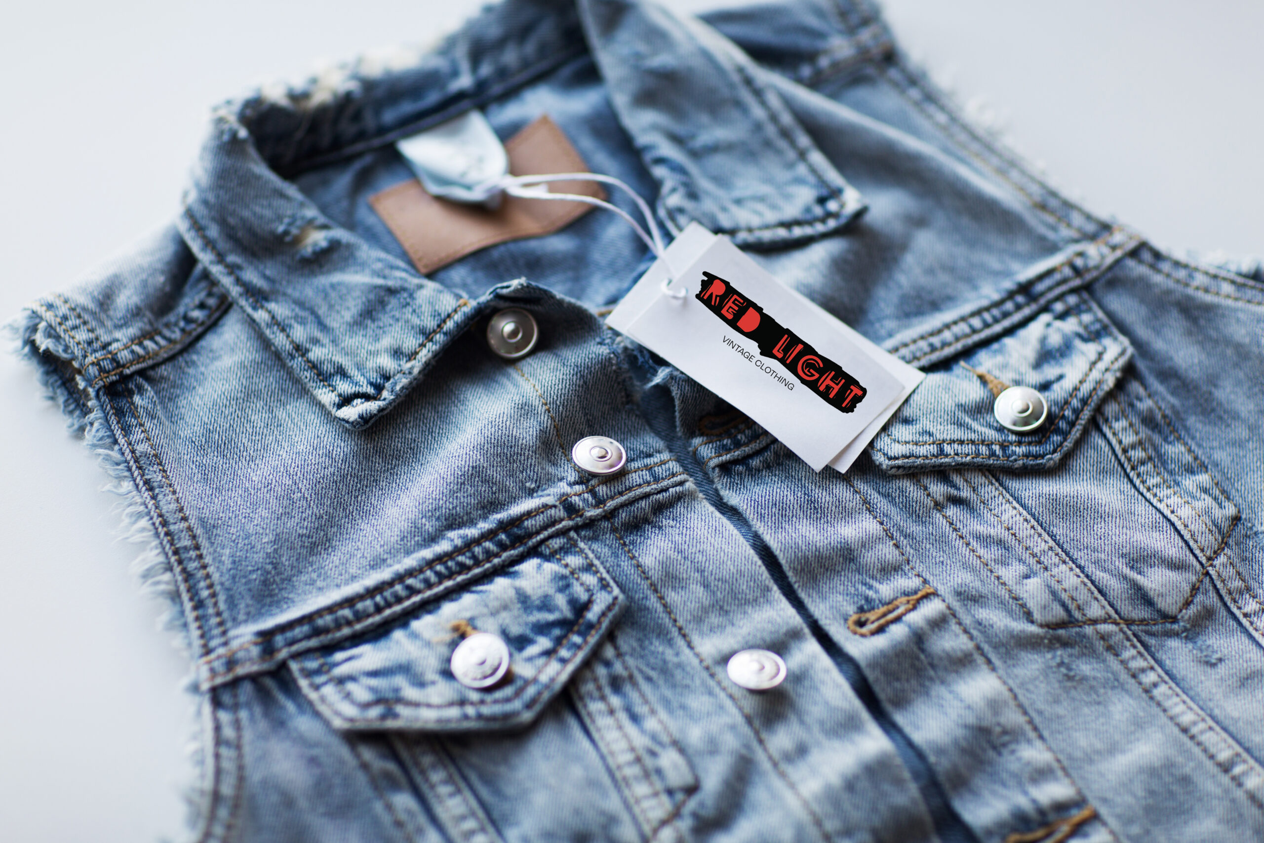
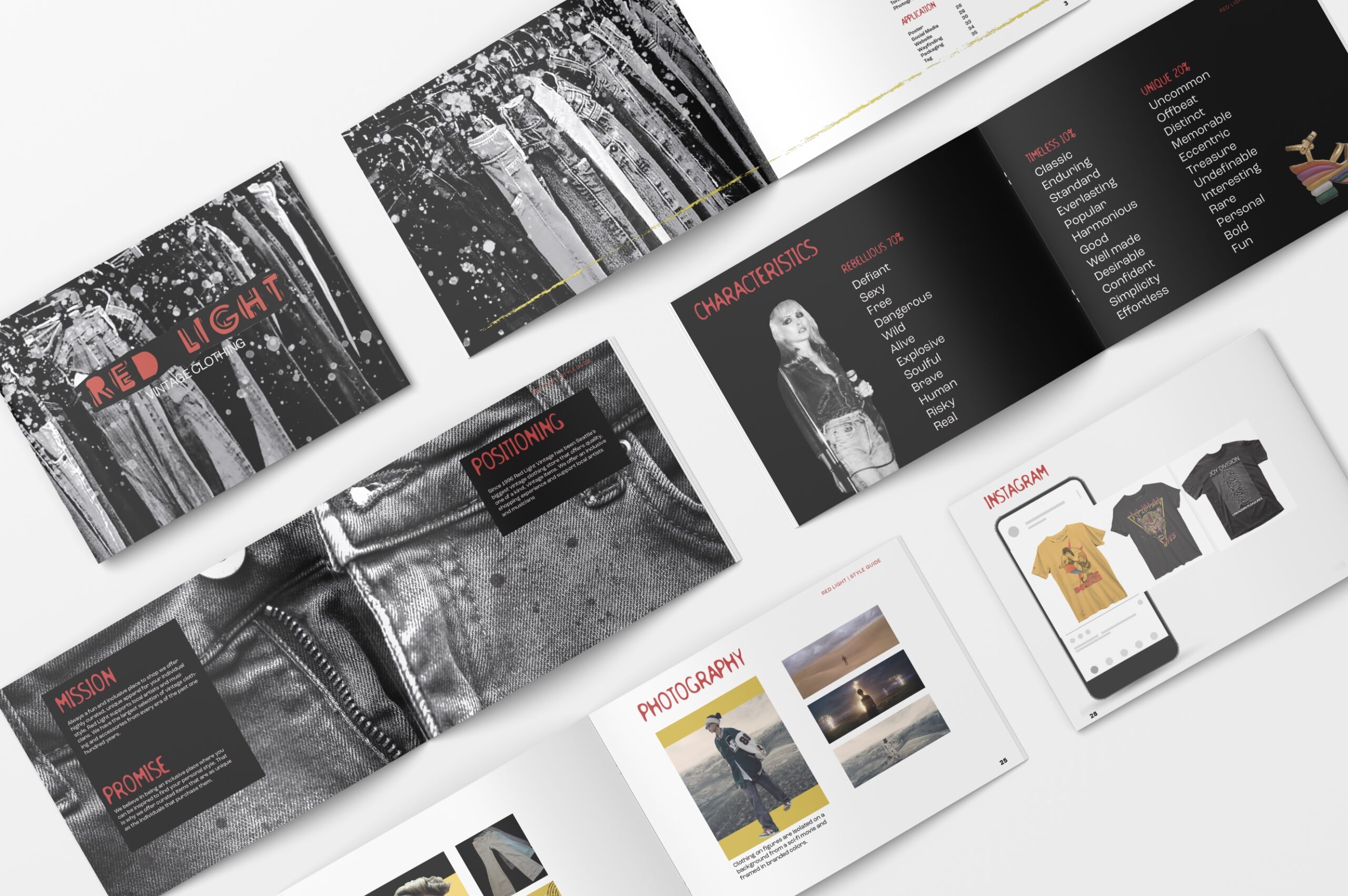
My hope for this redesign is instant recognition of a Seattle institution across all touch points. I wanted to honor the brands independent and rebellious spirit. The logo with the sharpie pen scratched background and the imperfectly filled in red lettering represent the beauty in the imperfect, bold and defiant.
Club Capri Spritz
- Art Direction
- Branding
- Packaging
- Web Design
- Visual Design
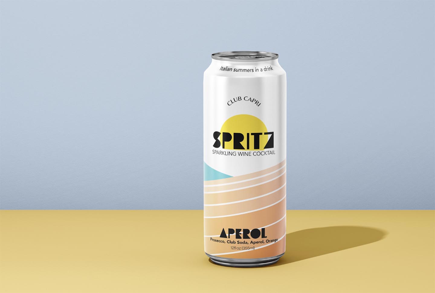
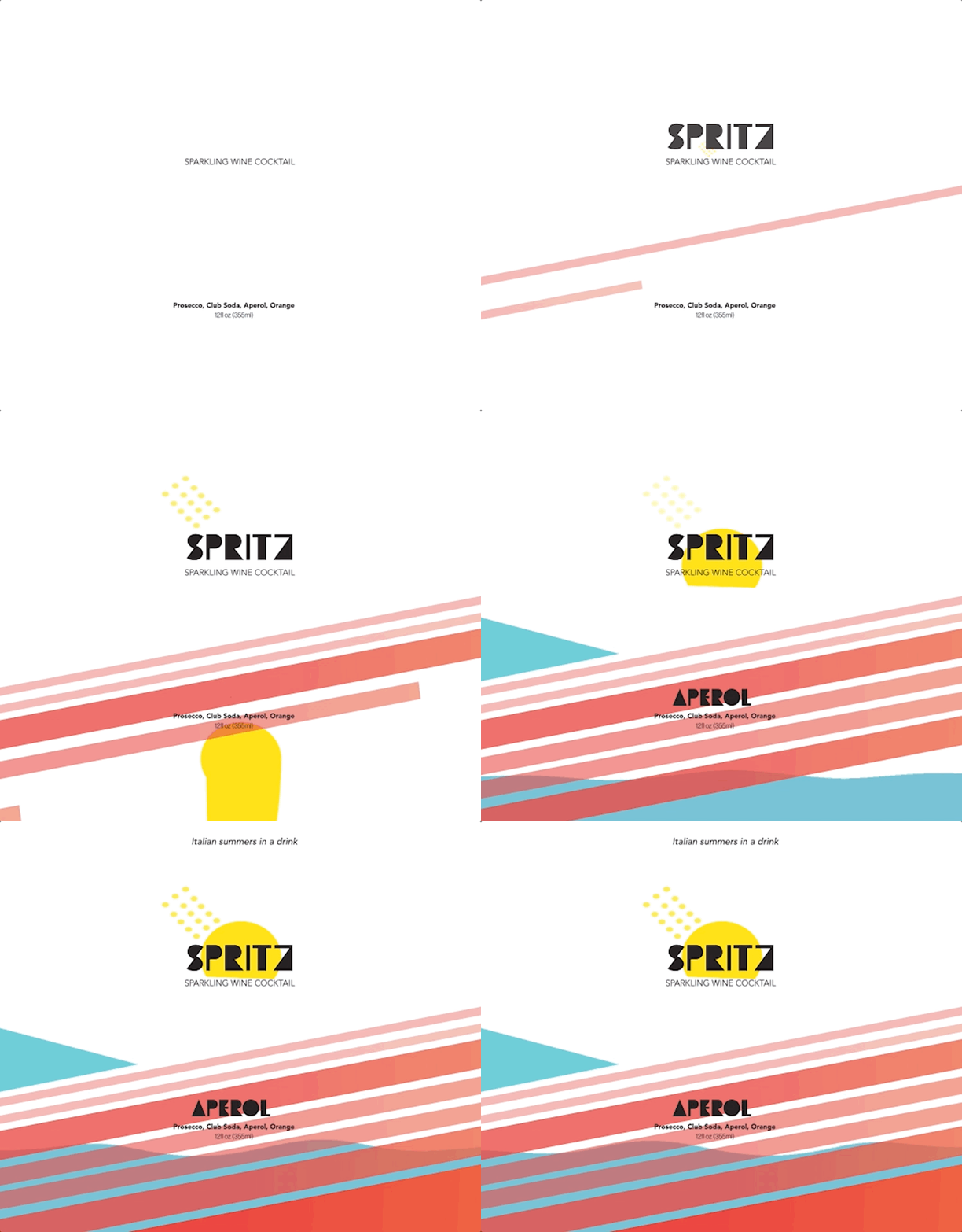
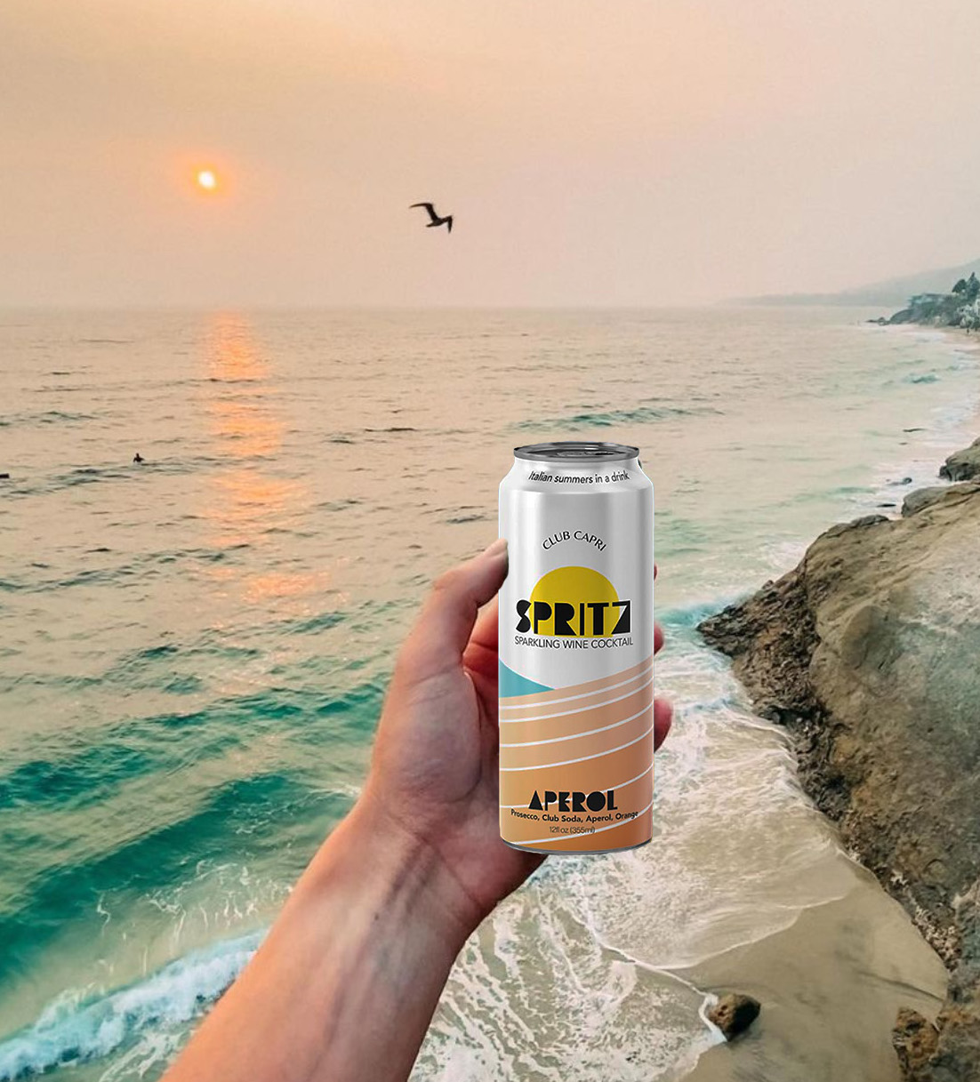
A sparkling wine cocktail that stands out from the crowd. A brand built on nostalgic days spent in the sun and swimming in the mediterranean sea. Bringing the brands message into the packaging to convey a fun, relaxing, Italian summer.

